Keeping brand colour consistent across filmed and AI images
When a colour looks wrong, first establish what is being compared: a logo, the physical product or the overall atmosphere. Each needs an appropriate reference.
Published: 2026-10-17
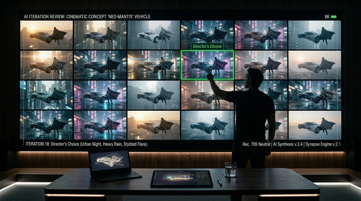
When a colour looks wrong, first establish what is being compared: a logo, the physical product or the overall atmosphere. Each needs an appropriate reference.
Agree one reference pack
Use approved artwork for logos, an agreed sample or product image for the item itself, and separate mood references for the setting. A warm kitchen reference should not silently turn a blue appliance into another colour variant.
Give filming, AI production and post-production the same reference versions. Compare representative test shots before extending the look across the film.
Make colour feedback specific
Record the shot, affected area, approved reference and intended adjustment. “The blue casing looks purple; keep the warm background” gives the team a clearer action than a request for a more premium colour.
Screens and viewing conditions can change how the same file appears. Agree a reference playback setup and have the colourist check the relevant settings. Review the exported deliverable as well as the working preview. Consistency is a production objective, not a promise that every screen will display an identical image.
Planning a film? Contact Kanon Film in Shanghai to discuss your brief.
WeChat: 18121248012 · q1210865781@gmail.com